Lightning Lookup Input Field
I am sure most of you who are reading this post are frantically searching Google for a way to put a lookup input field on a lightning component form. How do I know this? It’s because anyone who needs an input lookup field on a lightning component currently is told to build your own until Salesforce fixes the <force:inputField> to fully support lookups.
force:inputField issue
Sounds like it should work, and it sort of does, but not really. The big issue with the component is the fact that you can’t populate it when the component loads. You always have to search. If you never need the field to be filled in automatically, this standard component will work great. If you do, it is pretty much useless.
OpFocus to the rescue!
As a collaborative initiative, members of the OpFocus Development Team have created a component for lookup fields that is configurable not only in functionality but also in the look and feel. This allows for developers to have 1 component for various sorts of implementations without needing to change the component code.
Typically in a blog like this, we would walk through the code and explain what we are doing. Since I’m sure you already scrolled down to the bottom of the page in search for the link to the code to deploy to your sandbox, we are just going to cover the main ways you can configure this component.
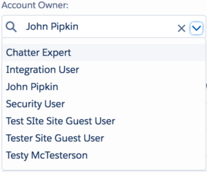
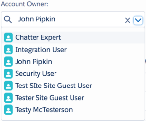
The component
The bare Necessities
* indicates required attribute
sObjectName – The API name of the Object to search
sObjectField – The Full Name property of the lookup field (e.g. Account.OwnerId)
*displayedFieldName – The field that is the lookup’s display value. Typically is “Name”
*valueFieldName – The field that is the lookup’s value. Typically is “Id”
label – The label of the input field.
selectedValue – The value of the lookup field.
Configuration #1: (defining the sObjectName manually)
<c:LightningLookup sObjectName=”User” displayedFieldName=”Name” valueFieldName=”Id” label=”Account Owner:” selectedValue=”{!v.myLookupValue}”/>
Configuration #2: (defining the lookup field instead of sObjectName)
<c:LightningLookup sObjectField=”Account.OwnerId” displayedFieldName=”Name” valueFieldName=”Id” label=”Account Owner:”selectedValue=”{!v.myLookupValue}”/>
Using help text
showHelp – Boolean to show help text
helpText – Manual set of help text
helpTextBelow – Boolean to show tooltip below (true) or above (false) help icon. Defaults to true.
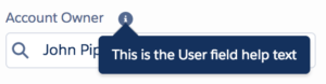
Configuration #1: (Show help text from field definition)
<c:LightningLookup sObjectField=”Account.OwnerId” displayedFieldName=”Name” valueFieldName=”Id” label=”Account Owner:” selectedValue=”{!v.myLookupValue}” showHelp=”true”/>
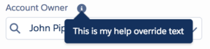
Configuration #2: (Show help text defined by component implementation)
<c:LightningLookup sObjectField=”Account.OwnerId” displayedFieldName=”Name” valueFieldName=”Id” label=”Account Owner:” selectedValue=”{!v.myLookupValue}” showHelp=”true” helpText=”This is my help override text”/>
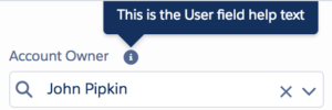
Configuration #3: (Show help text from field definition above the help icon)
<c:LightningLookup sObjectField=”Account.OwnerId” displayedFieldName=”Name” valueFieldName=”Id” label=”Account Owner:” selectedValue=”{!v.myLookupValue}” showHelp=”true” helpTextBelow=”false”/>
Note: In order to get the help text from the field definition, you must specify “sObjectField” attribute.
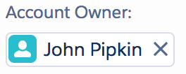
Icons
svg – The name of the icon, as defined by lightning:icon documentation
Configuration #1: (Show user icon when searching)
<c:LightningLookup sObjectField=”Account.OwnerId” displayedFieldName=”Name” valueFieldName=”Id” label=”Account Owner:” selectedValue=”{!v.myLookupValue}” svg=”standard:user”/>
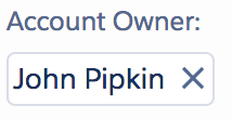
Pills
pills – Boolean that determines if pills are used (true) or just displayedFieldName value
Configuration #1: (Use pills to display selected value)
<c:LightningLookup sObjectField=”Account.OwnerId” displayedFieldName=”Name” valueFieldName=”Id” label=”Account Owner:” selectedValue=”{!v.myLookupValue}” pills=”true”/>
Configuration #2: (Use pills with icons to display selected value)
<c:LightningLookup sObjectField=”Account.OwnerId” displayedFieldName=”Name” valueFieldName=”Id” label=”Account Owner:” selectedValue=”{!v.myLookupValue}” pills=”true” svg=”standard:user”/>
Other notable Attributes
whereClause – Where clause for typeahead query
required – Whether field is required
disabled – Whether input field is disabled
otherFields – Other SObject fields that should be included in the selected result
cmpId – User-defined GUID for component. (For use in events)
selectedName – Value of the selected record’s displayedFieldName
selectedRecord -SObject record of the selected result
Events
EvtChangeLookup – Fired when lookup field changes (Attributes: name, record, recordId, recordName. “name” is GUID defined by cmpId attribute)
EvtClearLookup – Fired when lookup field value is cleared (Attributes: name. “name” is GUID defined by cmpId attribute)
EvtInitLookup – Fired when lookup field value is populated on init (Attributes: name. “name” is GUID defined by cmpId attribute)
Download
You can download the code on github or get custom development help directly from us.
If your team is overwhelmed or you’re looking to fast track your upcoming projects, our team of consultants is here to help. Connect with a member of our team to discuss your project, then access a deep bench of Salesforce consultants to meet your needs. Are you ready to reach for operational excellence?
Happy Coding!