Reports and Dashboards with David Carnes – Salesforce Camp Success
Can you effectively access your Salesforce data or does it take time to pull up the information you need? Our very own David Carnes spoke at Salesforce’s Camp Success about how reports and dashboards can show you the exact data you need. He covered how reports are made, used, and even provides 2 prebuilt dashboards to help get started. Whether you’re a Salesforce veteran or just diving in, you’re sure to walk away with valuable insights.
1) Folders and Favorites Keep You Organized
It’s important to cover how reports are created, selecting the fields relevant to the report you’re building. Folders and the favorites tab are then used to organize reports. You can nest up to 4 levels of folders providing greater flexibility with how content is stored.
Folders also allow you to specify different permission sets for content, ensuring people only see relevant material. David pointed out that certain people (especially higher-ups) don’t need to see many of the reports being built. Only the first level will define the permission set when you next folders. Keep this in mind when applying permission sets.
Store the content you visit most often in the favorites tab. Reports and dashboards can be added here for quick access. You’re also able to add a variety of content to your favorites, not just reports, and dashboards. This is one way to jump directly to the content you use most often. Your favorites tab is specific to you so store the content you use most often.
2) Report Descriptions Matter
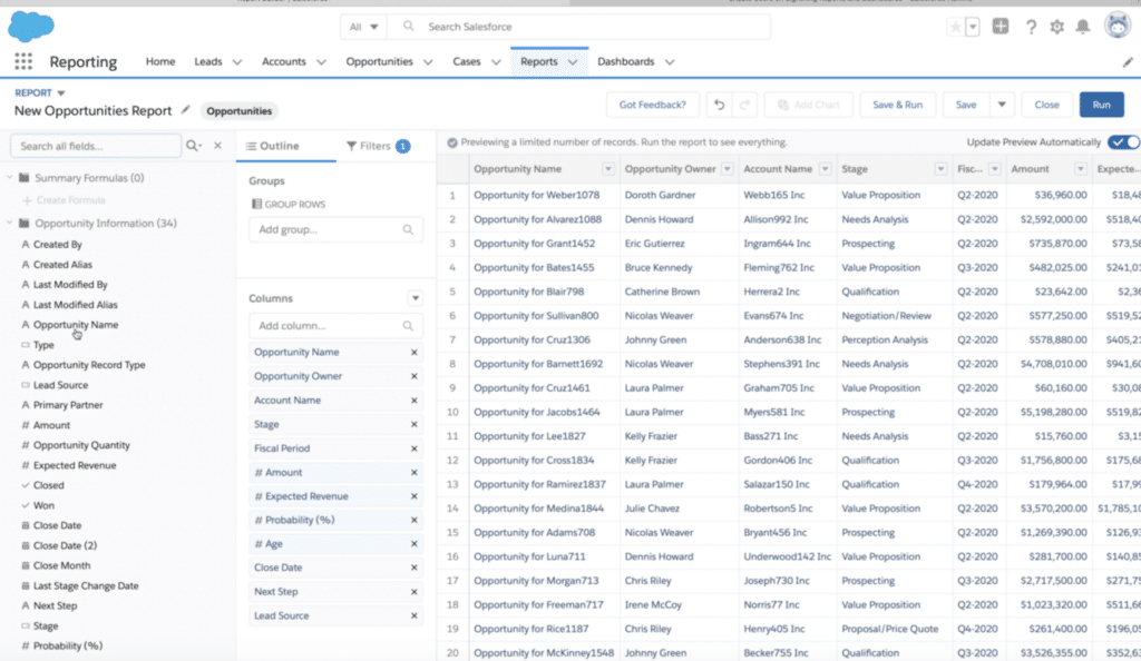
David touched on the “description” field mentioning “I wish this field was required for every report.” He discusses how this field helps you and your team stay on the same page. By clearly describing what the report shows, you’ll avoid confusion.
It’s useful to look at the “Last Run Date” to identify to see which reports haven’t been updated recently. Refresh your data if this field is outdated. Subscribing to a report lets you receive updates at regular intervals or when specific conditions are met. Doing so makes it easy to keep eye on reports you’d like to check often.
3) Visualize Your Data
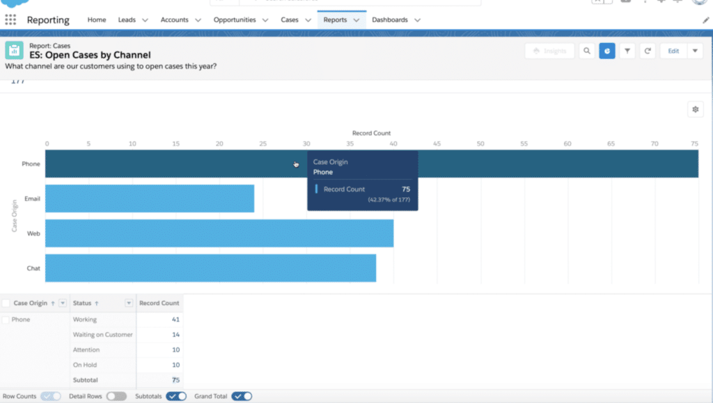
David covered how reports can be converted into tables with the click of a button. This makes the report easier to understand and share with colleagues. Specify the type of chart or graph and the colors that should be used. Present the information how you need it displayed. Play around with the options to see what works best!
4) Customize Dashboards
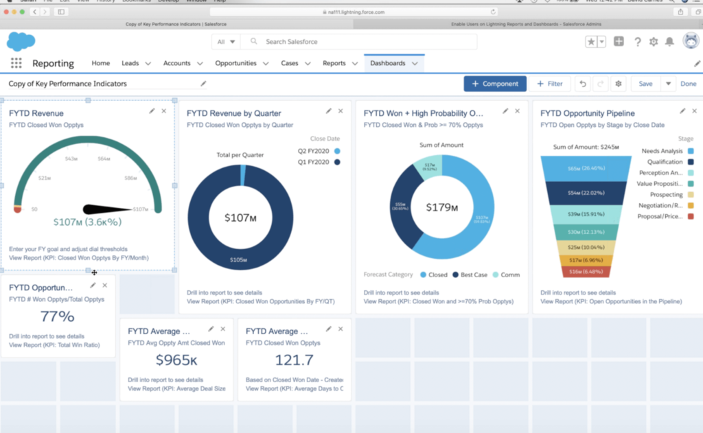
Dashboards are the best way to quickly see all the data that’s important to you. They are fully customizable and can hold up to 20 components. The refresh date is important to look at and will let you know how recent the data is. The data can be refreshed if it is out of date.
You’re able to select a dashboard’s layout, components, where each one belongs, and even how large they are when designing a dashboard. The drag and drop functionality makes this easy to play around with until it looks the way you’d like. Add your new dashboard to your homepage for easy access.
5) Keep Learning – Play
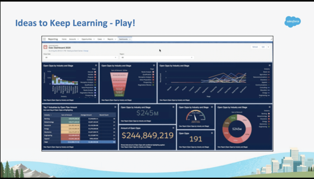
A final note that David left us with was an Idea to Keep Learning – Play. This report shows how the same report can be displayed in over 20 different ways. Present data exactly how you would like it displayed.
As you dive into dashboards or develop the ones you already use, play around to see what works best. Get started with the 2 free dashboards David made available!
Closing Thoughts
Are you ready to improve the way you use Salesforce and access the data that really matters? Start putting reports and dashboards to work! Follow along with David‘s webinar to see how versatile these tools can be. If you want to further develop your Salesforce knowledge, sign up for David’s 2-day Hands-on Lightning Reports and Dashboards course to take your skills to the next level!