Use Trending in Salesforce For Powerful Charts & Dashboards
[fusion_text]Peter Drucker was quoted as saying, “What gets measured gets managed.” As a continuation of the thought, I’d like to add, “Measurements that are trended over time are better understood and more likely to be acted upon.” Combine these two thoughts with the power of Charts and Dashboards in Salesforce and we’re on to something big. Sadly, we see too little use of trending in support of business decisions, leaving executives to draw their own conclusions to the full meaning of a particular metric, each time they see it.
Out of the box, Salesforce gives us a number of ways to track and display trends:
- Use actuals such as Create Date or Close Date
Simply choose a date field to group by, such as Lead.Created Date or Opportunity.Close Date and use it to group by on a Summary or Matrix Report. This approach works well if there is no chance of data being deleted. [Note: out-of-the-box in Salesforce every user can see most standard object data and delete most standard object data.] Two examples include:
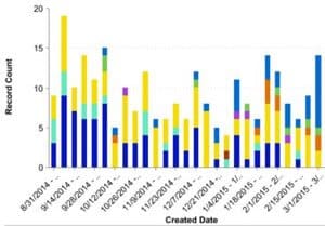 A) Opps Created by Week by Current Stage
This type of trending pulls double duty, as it shows both a count of Opps created by week and also a rough sense of how long the sales cycle is by showing the current Opportunity Stage. The trend becomes clear in the Stage striations as the weeks go by. In the example to the right, knowing yellow, light blue and navy blue show counts of Closed Opps with Stage equal to Dead, Lost and Won, we can see that the sales cycle for the most part is less than a few months long. At some point in the past, all Opps created in a particular week should be Won, Lost or Dead; Opps created in the current week are most likely to still be in play.
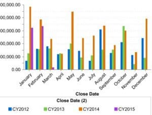 B) Year Over Sales Bookings by Month
Create an Report showing Won Opportunities over a period of years, sum the Amount column, set it as a Summary Report and then group by Close Date (Calendar Month in Year) and Close Date2 (Calendar Year). You’ll end up with something like the chart to the right. These can be great in identifying seasonality. This particular business seems to have a predictable lull in March and April, and again in September and November. We might use this information to time marketing campaigns or help determine forecast feasibility.
- Use out of the box Opportunity Trend Reports
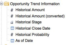 Salesforce’s Opportunity Trends report functionality has been around for more than 10 years, quietly waiting for advanced report writers to find it. It provides for access to Historical Amount, Historical Stage, Historical Close Date, and Historical Probability via an As of Date filter. Salesforce copies this Opportunity data on the first day of each month and makes it available for reporting when using the Opportunity Trends Report Type.
To access this information in your reporting simply create a Report on Opportunity Trends and use these trend fields as columns, in groupings, and in filters on your Report. Keep in mind that as with all trend reporting, it is very important that your sales staff keep their Opportunities up to date and not let deal Close Dates, Stages and Amounts slip without regular updating. If someone wins a deal on the 31st of a month, but doesn’t update the Opportunity until the next day, the historical trend will be off with no way to correct it. Also, if an Opportunity is ever deleted, there is no way to reconstruct this history for trending.
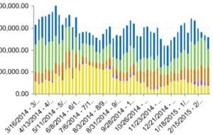 Create a Reporting Snapshot to Collect Trend Data
We’ve written about how to setup of Reporting Snapshots in Salesforce (formerly known as Analytic Snapshots) in an earlier blog post. They are a great way to collect, organize, and protect data to support trend reporting. Reporting Snapshots are available in Professional, Enterprise, Unlimited, and Developer Editions, supporting snapshots on up to 2000 records at a time on detail or summary data. Building one involves building a source Report, creating a Custom Object to serve as a receptacle of snapshotted data, the setup of a snapshot definition (which columns on the Report feed which fields on the Custom Object, and how often is it run), and then the creation of Reports and Dashboards on your snapshotted data. These can be valuable because they support daily, weekly and monthly snapshots. The screenshot shows 52 weeks of trended pipeline data, grouped by stage- it tells a story of pipeline health, which when combined with knowledge of Opportunity wins and losses, can give a lot of insight into pipeline shifts.
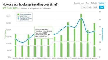 Outside of what Salesforce gives us, there are other more powerful options available. One paid app that offers great insight into trends in your data is InsightSquared. InsightSquared is a Cambridge, MA based analytics company with offerings for Salesforce, QuickBooks, and staffing and recruiting. They give away a number of free analytics apps on the AppExchange. At OpFocus we use a combination of native Salesforce Dashboards and InsightSquared’s sales and marketing analytics to drive our business.[/fusion_text]
