Salesforce.com Joined Reports: Joining the Dashboard Revolution
One of the things that makes Salesforce.com the most revolutionary CRM solution in the cloud is the Analytics feature set. Of course we all have things we want Salesforce.com to add to its reporting functionality (such as grand totals for custom formulas actually calculating grand totals instead of running the custom formula on the grand total row, but I digress), and sometimes, getting Analytics to show things exactly how you want them is a black art (I’m looking at you PREVGROUPVAL and PARENTGROUPVAL, or adding a custom field to a Custom Report Type), but there are some pretty powerful reporting tools such as Custom Reporting, Custom Report Formulas, and of course, Joined Reports.
Joined Reports
Joined reports give us the ability to bring together data across multiple unrelated reports and do cross block calculations and very powerful reporting, that sometimes referred to as ‘Scorecards.’ Consisting of up to five blocks, using both standard and custom report types, filtering of individual blocks, and more, Salesforce.com Analytics is getting closer to the Nirvana of only being limited by a User’s imagination.
Dashboards
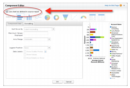
Before Winter ’13, Joined Reports weren’t available to add to dashboards, but that limitation is no more! Winter ’13 now allows Joined reports on Dashboards (Winter ’13 release notes, pp. 88-89). Simply build a chart on your Joined report, add the same chart type to a Dashboard, select the Joined report as the source, and you’re almost good to go. The final step is to ‘Use chart as defined in the source report’ by editing the dashboard component and checking the box.
Chart Types
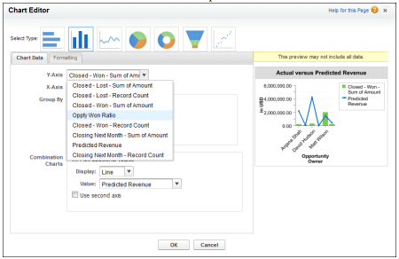
Any chart type available for Summary or Matrix reports are available for Joined Reports (although chart types only available on dashboards, such as gauges, metrics, or tables are not available for Joined Reports). Further, per the Salesforce Joined Reports Cheatsheet, data from both standard and cross-block formulas are available to display on charts. Finally, summary field names contain both field name and block name to aid in identifying the desired data to display.
Limitations and Gotchas
Some of the limitations of Joined Reports on dashboards include:
- The only items on the dashboard that can be modified are the ‘Display Units’ and ‘Drill down To’ (a very cool, often overlooked feature that allows a Dashboard Component to link to another Dashboard instead of a source report).
- Joined reports in dashboard view can’t be filtered based on data.
- Dashboards that only have Joined reports can’t have a filter added.
- Just because a field contains the same data across objects does not mean they are guaranteed to allow grouping across blocks. For example, if a lookup field to account name in a managed package has a different label than Account, grouping may not be possible.
- Joined reports require that the new user interface theme be enabled. Users without the new theme are unable to create, edit, or run joined reports. See Enable New User Interface Theme.
Photo Credits: Salesforce.com Winter ’13 Release Notes and Salesforce.com Joined Reports cheat sheet