New Analytics Features in Spring ’14 Release
 In October, when I wrote about some of the features in the Winter ’14 Salesforce.com release, I said that before we knew it, the Spring’14 release would be upon us. If you endured a winter like those of us in New England did, then you can appreciate that any signs of spring, even in name, are a welcome sight!
If you’ve done any reading about this release, then you know the buzz is around the Salesforce 1 platform and some other great features that my colleague Jenny recently discussed. However, in today’s post, I want to focus on some of the exciting new functionality that has been added to reports and dashboards to bolster analytics.
Two Quick Things Admins Can Do That Your Colleagues Will Love
When reviewing the release notes, I always like to find new tools that are easy for admins to implement but that their Salesforce users will love right away. In the Spring ’14 release, Salesforce offers two such analytics features: exporting reports without footers and hiding report types.
The report footer is the standard text at the bottom of an exported report that looks something like this:
While this information may be useful for some, until now there was no way to turn this off. With Spring ’14 you can disable report footers by going to Settings | Customize | Reports & Dashboards | User Interface and checking the “Export Reports Without Footers” box.
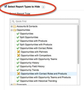
The other new tool for system administrators is the ability to hide report types. This is wonderful news because Salesforce offers a tremendous number of report types, and for many users it is very overwhelming trying to figure out the right one to use. Now anyone with the Manage Custom Reports permission will see a “Select Report Types to Hide” option.
When selecting the available report types, the green checkbox indicates they are available and the orange x indicates they are hidden. If all report types in a folder are hidden then the folder will also disappear. This is an easy, fast option to clean up the report type clutter, though one limitation is that it is all or nothing. At this time report types cannot be restricted by role or profile.
Floating Headers in Summary and Matrix Reports
Here is another small win that most likely does not need to be enabled (though if you do, it can also be found under Settings | Customize | Reports & Dashboards | User Interface), but you’ll want to point it out to your users in case they miss it. When working with a report that has many rows of records, as you scroll down the page it can be easy to lose your place as the headers disappear off the screen. However, that all changes with floating headers.
Previously tabular reports had an option to display the header row as you continued to scroll, but this has been expanded to summary and matrix reports. As soon as the headers disappear from view, a small arrow appears on the screen. Once clicked, all of the headers appear and stay on the page until clicked again to minimize them.
Embed Charts in Salesforce 1
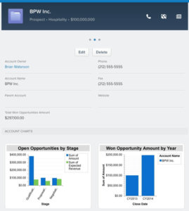
As I discussed in a blog article about Winter ’14, charts can now be added to page layouts within Salesforce. This essentially creates a “mini-dashboard” that is specific to the record you are viewing. I love this feature because you can get an instant snapshot about the record without having to jump into Reports or Dashboards for further information.
These embedded report charts are now be available when viewing records through the Salesforce 1 app, meaning you have access to the same information whether you’re viewing the record on your computer or on your smart phone. If a member of a sales team is about to visit a client, he or she can very quickly and easily see their current opportunities or history of won business as they are walking into the building.
Flexible Sorting in Reports
The enhanced sorting feature in Reports provides a whole new way to analyze data. Historically a summary report could only be sorted by one column, but now the sorting can be customized for each grouping. Let’s take an opportunity summary report with the following levels of groupings:
Level One: Close Date by Month
Level Two: Type
Level Three: Stage
Previously your sorting options were limited such that if you sorted Close Date in ascending order then the other groupings would also be sorted this way. Now it is possible to choose how each level is sorted.
How is this beneficial? Using the above example you have more combinations of ways to sort and analyze the data, such as Close Date in ascending order but Type by record count in descending order and Stage by Amount in descending order. This makes it easier to see if a given month is leading in one opportunity type or another (e.g. new business vs. existing business) or if a month has more opportunities close to closing or still in qualification.
Dashboard Filters
As my colleague Jesse Lingo discusses in further detail in a recent post on Dynamic Dashboards, Salesforce now allows for named filters to be created. This works similar to bucket fields in reports, where different values are lumped together.
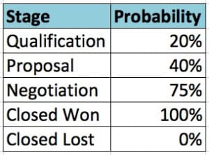
Let’s look at an example of how this can be used. Imagine your open opportunities had the following stages and probabilities:
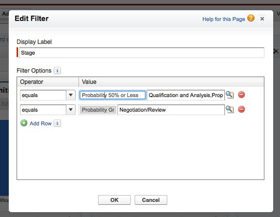
Now, imagine you want to allow the sales team to filter their dashboard based on open opportunities with a probability of 50% or less or a probability greater than 50%. You can create a Stage filter, assign labels of “Probability 50% or less” and “Probability Greater than 50%,” and assign the Qualification and Proposal stages to the first group and the Negotiation stage to the latter group. Now your sales team has easy access to these filters when running the dashboard and has a clear understanding of what the filters represent.
Conclusion
When I visit a company to start a new Salesforce engagement, reports and dashboards are often the tools that everyone is most excited about. At the same time they have so much power that sometimes people do not quite know where to begin. By implementing some of these new features and training your team on some of the other enhancements, you will be able to offer more robust ways to analyze the performance of each department and the company as a whole. Of course if you need help setting a strong analytics foundation, please do not hesitate to ask the team at OpFocus.
Happy reporting!
Image credit: http://4hdwallpapers.com/wp-content/uploads/2013/03/Sky-and-Spring-Flower-1024×768.jpg

