How to Add Dazzle to Your Salesforce.com Dashboards with Visualforce
Here are some ideas to add dazzle to your Salesforce.com Dashboards:
- Add a photo of your recent sales contest winner.
- Post a video of the winning foursome from your partner golf tournament.
- Show a photo of your sales trainer, along with a link to a podcast of recent sales training.
- Display summary data from another system entirely.
- List out definitions of acronyms or ratios used on the Dashboard.
 Salesforce.com allows us to create Dashboard Components that are Web pages, called Visualforce pages- anything that can be put on a Web page can be put on a Visualforce page. Beyond that, with Visualforce, we are able to interact with Salesforce.com data AND the API- so with some Apex coding talent, we can pull in and format data from other systems. As long as you keep the footprint of the Visualforce page small enough to fit within a Dashboard Component, you can display whatever you want.
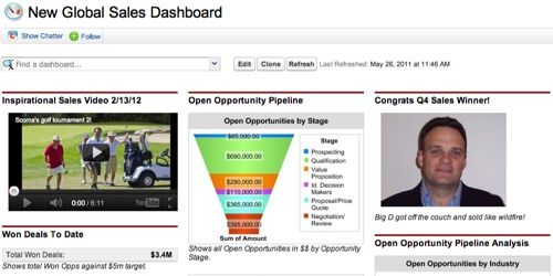
To achieve the screenshot below, I created two Visualforce pages- one in which I embedded a YouTube video (cutting the video’s dimensions in half to fit my Dashboard), and the other in which I simply pulled in an image of (who else?) myself as the Q4 Sales Winner. Then I added two Visualforce Components to my Dashboard, pulled in my visualforce pages, added header text, and set the preferred Component heights.

When pulling Web content like this into a Visualforce page, you can call images, videos, etc from another source on the Web (providing that you have some control of the content to know it will be there for as long as you need it) or by uploading the content into your Salesforce.com system as a Static Resource.


