How to Create a Dynamic Picklist in Salesforce Visualforce Charting
I recently had the chance to play with Salesforce Visualforce Charting and I really liked the animation feature that allows users to click on a legend to filter out the values in the selected group from the chart. To build a simple chart it was very straight forward, but when I tried a stacked bars, I really struggled to get it to work, especially with dynamic picklist values. The major issues were:
- I didn’t know how to show the Grouped by names in the legend without hard coding them (in this case, I grouped by Opportunity Stages.)
- If a new picklist value was added to the picklist field, I had to modify the Controller and the Visualforce Charting page to include that new value.
After a long brainstorming with MJ Kahn (our VP of Development & Product Strategy), we came up with a solution. Here’s our nice little tricky solution for the Opportunity Revenue Chart!
Step 1: Create OppData object inside the Chart Controller
Click here to see the controller code: OppRevChartController
The OppData object has a lot of Integer fields (data0 – data20), each of them is a bucket of aggregated results from SUM of Amount in each Stage. The object also has a String field (name) and a List<String> (lstStgs.) The String for grouped by Opportunity Created Month and the List<String> is for a list of all available Opportunity Stage names. I only have 10 Stages in my Opportunity Object, but I have 21 data fields to my OppData object. Why do I need 11 more Integer fields? Because I need to have extra buckets for new Opportunity Stages that might be added in the future, so I don’t have to update the Chart Controller every time a new Stage is added.
Step 2: Assign SUM(Amount) grouped by StageName to each “data” field
There is a method that assigns SUM(Amount) grouped by StageName in the aggregated results to the data fields in the OppData object. The method is “addNumForStage.” It sets the SUM(Amount) to OppData based on the data field name and the index number of the Stage in the lstStgs. For example, if the StageName (stg) from the aggregated result is “Open” and the lstStgs has “Open” as the index number 0 on the list, then the Amount of “Open” is assigned to “data0.”
Step 3: Create a String that separates each Field Name with a comma for barSeries: yField
Use the following statement to join all the data fields that are in the range of numbers of available Opportunity StageName and add it to a String called “listOfFieldNames”.
public String listOfFieldNames {
get {
String str = ”;
for (Integer i=0; i<lstStages.size(); i++) {
if (str != ”) str += ‘,’ + ‘data’ + (i);
else str += ‘data’ + (i);
}
return str;
}
}
Now I can use “listOfFieldNames” as a merge field for yField in <apex:barSeries> tag.
Step 4: Create a String that separates each Opportunity Stage with a comma for barSeries: title
[separator top=”10″ style=”single”]
Use join(Object, String) static method to join all the values from OpprotunityStage sObject and add it to a String called “stagenameslist” like this:
public String stagenameslist {
get {
return String.join(lstStages, ‘,’);
}
}
Now I can use “stagenameslist” as a merge field for title in <apex:barSeries> tag.
After we get all the data for the Opportunity Revenue Chart, we can finish the chart with a very short Visualforce page code:
<apex:page controller=”OppRevChartController”>
<apex:chart data=”{!OppData}” width=”40%” height=”100%” theme=”Salesforce” background=”#E6E6FA”>
<apex:legend position=”right” font=”bold 8px Helvetica” padding=”5″/>
<apex:axis type=”Category” position=”bottom” fields=”name” title=”Month” margin=”0″>
<apex:chartLabel rotate=”300″/>
</apex:axis>
<apex:axis type=”Numeric” position=”left” fields=”{!listOfFieldNames}” title=”Revenue” grid=”true” steps=”1″ minimum=”0″/>
<apex:barSeries orientation=”vertical” axis=”bottom” xField=”name” yField=”{!listOfFieldNames}” stacked=”true” title=”{!stagenameslist}” >
<apex:chartTips width=”150″/>
</apex:barSeries>
</apex:chart>
</apex:page>
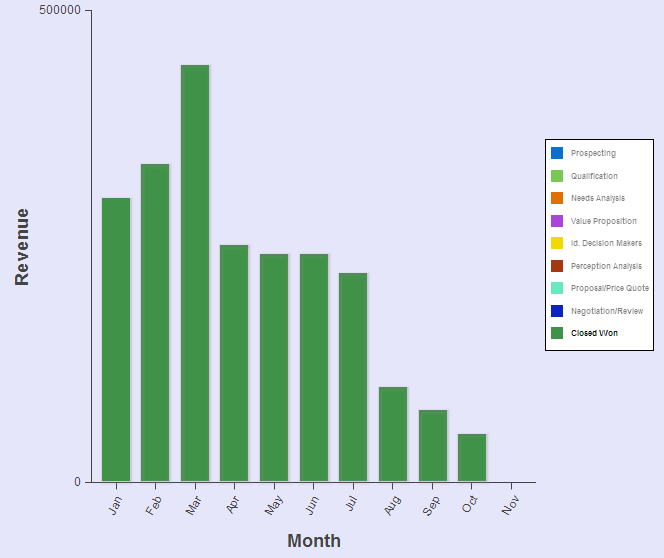
Below is the same chart as the above, but it only shows Closed Won because I filtered all the other Stages out by clicking the Legend.
Visualforce charting can be very handy when you want to show a chart to users who don’t have visibility to the object in the chart.
[tagline_box backgroundcolor=”#eaeaea” shadow=”yes” shadowopacity=”0.1″ border=”1px” bordercolor=”” highlightposition=”top” link=”https://opfocus.com/contact-us” linktarget=”_self” buttoncolor=”blue” button=”Contact Us” title=”Want our Developers to create this for you?” description=”If you think this feature would be useful for your company, contact us and we’ll connect you with our awesome Developer team.” animation_type=”slide” animation_direction=”down” animation_speed=”.5″][/tagline_box]